As the
Victorian State election weekend approaches, it has become obvious that it is
not practical to await the finalisation of the US midterm results in New York's
22nd and 27th, Utah's 4th and Georgia's 7th districts, and it will be a week
until the special election for Mississippi Senator holds its run-off vote.
Therefore,
this week will be dedicating two posts to the Victorian election--this one,
which summarises some numbers I've been playing with while waiting, and one
later in the week with the normal predictions. Summaries of the Victorian and
US elections will follow when permitted.
What
follows are the barely coherent ramblings of an
impatient amateur psephologist looking for patterns in the clouds. You have been
warned.
The Numbers Game
While
waiting to see if there would be time to push out a US election summary before
Victorians went to the polls, I went back to this blog's roots to try to find
better methods of predicting elections. Not much has come close to the simple
application of polling numbers to the pendulum, but even then, some seats have swings wildly different, and even contrary, to
the polled swings. The Victorian Electoral Commission has easily available data
for state elections dating back to at least 1999. Using this data, can we work
out which seats will have greater swings than others?
The
obvious first test is to see if certain seats are simply more volatile than
others. This is something I have tried before without success. Intuitively
it makes sense that some seats (say a stereotypically conservative,
Liberal-voting rural seat) will have many "rusted on" voters, others
will have far fewer, and that the magnitude of swings will vary proportionally
with the number of rust-free voters. Once again, the data does not seem to
support this.
This
table shows the number of voters on a two-party preferred basis* and calculates
the margin as [ALP/(ALP + Coalition) - 50%] so that the more positive, the
larger the margin for Labor and the more negative, the larger the margin for the Coalition. The swing is then calculated for each seat as [the
subsequent margin - the previous margin].
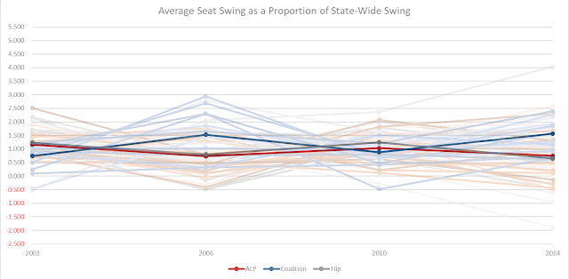
Next, we
took each swing as a proportion of the state-wide swing. If there was such a
thing as a more volatile seat subject to greater swings, this number should
come out consistently greater than 1, with less volatile seats consistently
below 1 and contrarian seats (i.e. seats that swing in the opposite direction
to the state) below 0. The results were...
erratic.
Interestingly,
though, some semblance of a pattern did emerge when considering only seats that
had always been ALP- or Coalition-held:
In
reliable ALP seats the 99-02 and 06-10 swings were generally larger than average
(median 1.17× and 1.03× the state-wide swing respectively) and noticeably lower
in 02-06 and 10-14 (0.74× and 0.75× state-wide). The reverse is true in
consistently Liberal seats (0.74× in 99-02 and 0.88× in 06-10; 1.53× and 1.56 in
02-06× and 10-14).
The
state-wide swings were 7.58% to the ALP in 99-02; 3.39% to the Coalition in
02-06; 5.97% to the Coalition in 06-10 and 3.57% to the ALP in 10-14. This means, even on our limited data, there
does not appear to be a correlation between the party favoured by the swing and
the size of the swing in ALP or Coalition seats. Nor is there a correlation
between which seats have larger margins and the successful party, whether the
results changed the governing party, or whether the incumbent government was in
its first term.
The
profile of the remaining seats seems to follow closely
that of reliable ALP seats.
One of
the major reasons for this may be that these seats are Labor-leaning. In 2002,
they were all won by Labor. Seven of the seats were lost by Labor only once, compared
with 4 for the Liberals.
This data
certainly seems to suggest there are groupings of seats that feel the impact of
some swings more than others. The rest of this post attempts to find some way
of accurately defining these groupings unsuccessfully. However, there is some
promise of developing a taxonomy of seats based on their susceptibility to swings
in various years, and perhaps determining the factors that make swings count in
these seats.
Fruitless searches
The
margin by which seats were held before and after a swing was compared with the size of the swing. The
correlation was minimal.
There was
a better correlation, paradoxically, when these margins were simplified to the categories of “marginal” (< 6%), “Fairly
safe” (=> 6%), “Safe” (=> 10%) and “Very Safe” (=> 20%) widely used in
Australia.


More
fruitful research may be obtained with a larger history, allowing seats to be classified into certain patterns of swing susceptibility,
then cross-referenced with geographic
data to identify common denominators and finally allowing an accurate
prediction of when a swing will be greater in a seat that the state- or national average. Until then, we will have to
use the generic swing we’ve been using previously.
*
Preference was given to the VEC's "Results after distribution of
preferences" data where available. Where
this was not available (because the distribution did not proceed all the way to
the final two, or one of the final two was neither ALP nor Coalition) the
"Two-party preferred vote" data was used. Grey cells indicated
an independent outperformed a major party. Green cells indicate the Greens
outperformed a major party. Yellow cells indicate the Coalition is represented by the Nationals in this count.
Italicised data predates a name change and may have been contested on notably different boundaries. Raw numbers are available
in the data dump, but colour-coding is
unfortunately lost.


No comments:
Post a Comment