Monday, 14 September 2015

Turnbull to Win Leadership Spill

Okay, so obviously a speculative shot in the dark without reliable quantitative data. Instead, we get qualitative data. Here are the three reasons I’m backing Turnbull tonight:

Turnbull is not a fool.


Firstly, this is Turnbull’s second stab at the Liberal leadership. If he loses here, he’s almost certain to be infected with Kim Beazley Syndrome. The major symptoms of KBS include being seen as a safe “rebuilder”, but never Prime Minister Material; regularly being ousted before an election; and never becoming Prime Minister. Turnbull would not make this challenge without confidence in his support.

It’s Monday Night. That’s not just a work night, a high news-watching night and a night when the 7:30 report is on; it’s also #qanda night. Tonight is about as high-profile a news night as possible. Tonight is a high-stakes night for a challenge.

The Canning by-election is this weekend. Undercutting the Prime Ministership this week could be catastrophic if Abbott loses narrowly. Either Abbott needs a massive show of support (and all counts suggest the vote will be very close) or Turnbull needs to win to revamp Liberal support ahead of this weekend. On the other hand, as Dr Bonham observes the Libs have a habbit of voting to change leaders in the lead up to by-elections. Abbott came to power against Turnbull the week of a double by-election (Higgins and Bradfield) six years ago.

Turnbull has picked his moment, and taken his best shot. If he cannot win now, he cannot win.

Abbott is not a fool.


Abbott immediately called a party vote within just over five hours. That gives very little time to recall travelling MPs – most believed to be on Abbott’s side – rather than waiting a day. While political implications of waiting a day might be problematic, I’d be surprised if that was given more weight than keeping the leadership. Abbott knows that, now Turnbull can publically challenge and canvas, his support will only fall among the party.

Abbott knows he’s in trouble and trying to minimise damage. And it could work. I’m not saying this is an easily predicted vote; tonight hangs by a thread from a razor’s edge balanced on a very thin line.

The People of Australia are not fools.


Firstly, I’ve noted previously, betting odds tend to be reasonably indicative of voting results. True, voting may do so indirectly – people may bet for their favourites, and the most popular candidates do well in democracies. In this case, where the public’s preference does not influence the outcome, sportsbet.com is probably less indicative than previously. Nevertheless, here’s the odds only a few minutes out:

Source: sportsbet.com

AND NOW

Watching the people entering the room, it is obvious that the Turnbull team seems smaller and more resigned than Abbott. On the other hand, Abbott insiders are suggesting they're confident of 45 votes, and Turnbull think they're optimistically looking at 57 votes to Abbott's 55 at around 55 to 57 votes. [Edit: Because obviously there aren't 112 votes on the table. I misunderstood some poorly worded sources that reported on the Turnbull camp expecting to win "with 55 to 57 votes"].

Is the A team being conservative (pun intended)? Did I get it wrong? Did the good people on sportsbet get it wrong? Only time can tell.

Tuesday, 21 July 2015

The Ultimate Showdown of Ultimate Destiny

There is not a huge amount happening in Australia on the electoral front. The next elections (barring any early disillusions) are the two territories more than twelve months away (Northern Territory on 27 August 2016 and the ACT on 15 October 2016)

Nevertheless, I have been encouraged to maintain an at least nominal output. I’m not planning anything drastic like actually tallying up my results and updating my counters just yet, though.

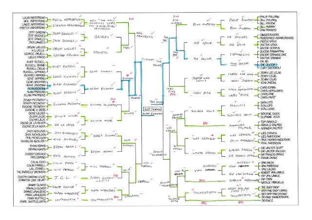
Some time back, Randle Munroe posted this bracket on his web comic XKCD. It’s not exactly enraged-bobcat-in-a-box slapstick, but it’s there. Now normally I don’t dabble in bracket construction; I have people to do that sort of thing for me. But then #xkcdbracket came along and made the whole thing psephological.

If you haven’t been playing along at home, the idea is simple – people vote, winner progresses. In reality, the whole exercise has been confounded by vote rigging, trash-talking and botanical classificatory disagreement. Some people might argue that a vote with no context or impact is meaningless. People like @xkcdbracket, for example. However, this is actually quite meaningful in that it eliminates a whole bunch of unquantifiable variables from normal elections (such as policy communication or making a choice that could shape several years of the nation’s politics and day-to-day life) and allowing us to analyse popularity and voting patterns in a relatively controlled environment.

The first vote for the preliminary finals is now open, which is a good time to start with some data under out belt and some excitement still to follow.

Here is my initial suspicions, based on my assumptions about the likes and interests of the standard XKCD audience:
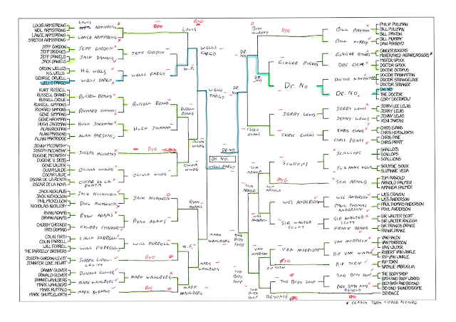
A more repeatable approach, however, is as follows: all initial pairings (or three- or four-cornered contests) were decided based on the number of google hits for each name. Fred Astaire was used as the search term for Mr Rogers, Gordon-Levitt was hyphenated (does that make a difference?) and Beyoncé was spelt without the accent. Live with it.

After that, Google Fight was used to determine the individual with the most exposure on the internet. I was looking forward to watching a stick-figure of Ginger Rogers laying into a stick-figure Doc Ock, but apparently Google Fight was overhauled some time since I was a young teenager and now you just get a boring graph.

This provides some very different results. For example, commercial ventures pay a lot of money on advertising which is why Wells Fargo and the cinematic juggernaut Dr. No made it to the finals, narrowly squeezing out The Body Shop.

I also see the potential for what I might call the Bieber effect but, in accordance with the Bieber effect, decide the name Kardashian effect is microscopically less off-putting. Basically, the idea that a person’s popularity on the internet does not equate to popularity – especially if they exist largely as the butt of jokes of subjects of complaint. Thus, while Justin Bieber may score very highly in a google-fight against the guy Neil Armstrong sued for the return of his hair, but we all know who’d win in an internet voting contest.

Nonetheless, that method gives these results:
Meanwhile, the actual progress into the preliminary finals so far is:

 
(Since the Doctor was taken out by Mr Spock (How did I ever imagine Whovians would outnumber Trekkies?) by unofficial prediction is Rickman v Spock in the Final)

How to Fight the Internet (and Win):

(Added 23/7/2015)

So, this is how the two methods did in the preliminary rounds:

 
Ticks represent correct predictions, crosses wrong ones. After the first tier, dashes indicate wrong answers resulting from a matchup that never occurred (i.e. influenced by earlier errors) while circles indicate that a correct prediction was made despite earlier errors.

Round 1
PsephologyKid: √:31 X:13 TOSSUP: 1
The Internet: √:17 X:28

Round 2
PsephologyKid: √: 8 X: 2 O: 2 -: 8
The Internet: √: 1 X: 1 O: 2 -:16

Round 3
PsephologyKid: √: 1 X: 2 O: 2 -: 7
The Internet: √: 0 X: 0 O: 0 -:12

Round 4
PsephologyKid: √: 1 X: 0 O: 1 -: 4
The Internet: √: 0 X: 0 O: 0 -: 6

TOTAL
PsephologyKid: √:41 X:17 O: 5 -:19 TOSSUP: 1
The Internet: √:18 X:29 O: 2 -:34

So, my method (or "hunch") had consistently more right answers and fewer wrong answers. Despite the fewer errors, my method also had more corrections ("O"s), probably helped by having more brackets with viable (tick or "O" candidates) and, obviously, fewer dashes.

My hunch also got one correct nomination into the preliminary finals (unfortunately we now know that Alan Rickman has been knocked out.) This doesn't help us develop a reliable predictive tool, but it DOES quite conclusively illustrate that internet popularity is not very useful to the predictive psephologist. (Sorry Wells Fargo.)

Wednesday, 6 May 2015

Mad Dogs and Englishmen

Hey hey hey!

I know, I know. I still haven’t analysed my results from my last post. I’ll get to it soon, I promise.

In the meantime, the United Kingdom of Great Britain and Northern Ireland will be electing a new house of commons today, so I’m going to take a very superficial look at that right…now.

A Very Superficial Look at That


There are 650 seats. They are elected on a first-past-the-post system. Most polls are predicting a hung parliament.

A Less Superficial Look at That


The following methodology was experimental and, like all good experiments, failed catastrophically. Since the British elections are a special update, this will not be added to the running tally. I know this will be a bad result. Let’s wait and see how bad.

As a rough guide, I’ve made a list of all parties that either won each seat last election or came within 15% of that candidate’s votes. A swing of that magnitude is significantly greater than polling predicts nationally, but also arbitrary.

In many seats, there is only one contender. In fact, the Conservatives were the only ones in 254 seats, with the Democratic Unionist Party picking up another 7 for the right wing. The Liberal Democrats, who joined the Conservatives in a coalition, were the only real contenders in 39 seats. Labour (I’m still getting used to spelling that wrong, which is to say right, which is to say with a ‘u’) gets 203, not counting 15 Labour and Cooperative party seats. Another 15 were picked up by left-wing parties (Plaid Cymru - 3, Scottish National Party - 5, Sinn Fein -4 and Social Democratic and Labour Party - 3). And finally Down North/North Down (if that’s not a contradictory constituency name) is definitively Independent with Lady Sylvia Hermon holding the seat after leaving the Ulster Unionists before the last election. To my knowledge she is contesting again today.

That leaves 116 in doubt, and our tossups are (650/20=17.5) 17 in number.


Add captionSeats determined by having no second candidate within 15% of the vote for the successful candidate

Above seats, expressed as a proportion of the House of Commons

One of these unknowns, Fermanagh and South Tyrone, can be called for Sinn Fein, since their main contender – an Independent – will not run today. More whittling required.

More whittling


I’m keeping it simple due to time constraints, the fact that this is not something I regularly do, and because first past the post is stupid. I’m just going to look at the results for each party in 2005 and 2010 and calculate the swing. I’ll compare that to the national swing. If, for example, the swing from party A to B nationally is twice that in the constituency of Hypotheticalshire North, I’m going to assume Hypotheticalshire North has more rusted-on voters and that the swinging vote is half the national average. Therefore, I’ll halve the national polled swing between A and B and apply that to the 2010 data.

Or, for the cool kids:


where C is the two party* constituency result in year X (or predicted for 2015) and N is the national result in year X (or polled result for 2015).

I applied this to all seats with more a party* within the 15% margin of the winning party (the “competitive parties”). Check the data dump for Table 1.

Now this does lead to some absurdities – swings in excess of 100% being the most obvious. I’ve left these since this is a very rough approximation of a prediction, but it does point out that this algorithm lacks the nuance that it hopes to capture by looking at the size of swings in a seat.
However, the multiplier (the number by which the national swing is multiplied to get the constituency swing) sometimes dips below 0.

This would require the seat to move contrary to the rest of the nation. This is not impossible, but I do not believe in seats that are always contrary to the swing. For this reason negative multipliers are set to 0 in Table 2 (see Data dump)

Now, despite how rough and very, very flawed this is, let’s plug these results into the previous tables.

(Not Honestly a) Prediction


"Prediction"

Above seats as a proportion of the House of Commons. A second Conservative-LibDem Coalition would have a majority. A Labour-LibDem Coalition will not.

‘nuf said.

* Hampstead and Kilburn has three competitive parties.

Data Dump

Constituencies and Candidates Within 15% of the Leading Candidate 2010

Sorry for the length. There's no easy way to deal with 650 constituencies. Also, sorry about the colours. I didn't pick them. (Red and Purple? Seriously Labour and Co-operative party.)


Table 1

Calculations of swing (2005-2010) by constituency, as a portion of the national swing, the multiplier to approximate one from the other and the application of this to current polling. [Polling source ICM 3-6 May.]


Table 2

As per Table 1, but with all negative multipliers set to 0.


Tuesday, 24 March 2015

New South Wales Rush


Contrary to how I would have wished, we have only a few days until the NSW state election and I have yet to post anything substantial on the subject. So this is going to be another dense, intense and something-else-ense post.

Firstly the baseline. Original margins courtesy of Anthony Green, as per usual and adjusted for recent electoral boundary shifts etc. The swing is calculated at 8% away from the Coalition based on the 2PP result in 2011 (64.2:35.8 favouring the Coalition) and the latest polling from Roy Morgan (up to March 23, 56:44 favouring the Coalition).

This gives the Coalition 55 seats (LIB 38, NAT 17) and the ALP 34 with four tossups. Since there are 93 seats, the maximum tossups allowed on this blog are (93/20 = 4.65, rounded down to) four.
Now, after our previous success beating the benchmark based on past voting history, we’ll be playing around with those methods a little this time.

Firstly, because it’s not called the Infographinomicon for nothing, here’s a chart of the historical incumbency of all current seats (including past incarnations) since the abolition of multi-member seats in 1927:


And here’s a chart of the results for all elections since that date:

In both cases there are some strong supporters of the Liberal (e.g. Vaucluse), Labor (e.g. Lakemba) and National parties (e.g. Upper Hunter), which is a promising start for a system of prediction based on seat consistency.

Firstly, let’s try to quantify how consistently each seat supports a given party. In the below chart, the parties are simplified to Labor or Coalition (Liberal + National). Each time the seat voted for the currently ruling Coalition parties, we add 1 to their total. Each time they vote Labor we subtract 1. Independents and minor parties contribute nothing positive or negative to the total. This produces a very primitive profile in the total column where 0 is neutral (voting for the Coalition as often as the ALP), positive numbers indicate the strength of support for the Coalition and negative numbers indicate the strength of support for the Labor party.


However, since 1927 the Labor party has son more elections that the Coalition. This means any seat that has a 50-50 2PP history is actually slightly Coalition leaning by comparison with the state average. And, since polling is averaged across the state, this needs to be taken into account. For this reason the STATE column contains the value the seat would have held if it had voted with the rest of the state at each election during its period(s) of existence. The difference, in the DIF column, is simple calculated by subtracting the STATE benchmark from the seat’s TOTAL, giving the seat’s position relative to the general public.

This number can also be reached by doubling the INDEX. The INDEX is calculated in the following way: starting at 0 add one each time the seat voted for the Coalition against the trend and subtracting one when it voted for the ALP against the trend. The DIF is double the INDEX because voting, for example, for the Liberal Party when the state was predominantly Labor actually increases the DIF margin by two – the seat’s total increases by one while the state’s total decreases by one.

However, these values don’t take the length of time the seat has existed into account. Epping and Monaro both have an index of 3, having voted for the Coalition on three occasions more than for Labor when voting against the trend. However, because Epping has only contested four elections, this equates to a history of entirely Coalition victories, while Monaro has a much more evenly split history dating back to 1927.

To combat this, the next table provides the index, the maximum (or minimum, for Labor leaning seats) value the index could have reached, and the percentage of times the seat favoured a party against the trend (INDEX/MAX x 100%).


A PERCENT rating of 100% means the seat is a bastion that always votes for its preferred party, regardless of any other factor. This value can be diminished by voting for the “other” party, and this diminishing effect will be more significant if voting contrary to the general population. Thus a rating of 0% means either the seat always voted in line with the public (bellwether) or voted against the trend for one party as much as the other.

Also, although this is already captured in the PERCENT, the CONTRA rating is the number of times a seat voted against its “preferred” party contrary to the trend.

The PERCENT rating allows us to recognise what percentage of elections a seat has historically supported their “preferred party” in. If a seat has a 90% rating in favour of the Coalition parties, for example, it supports the coalition in all but the 10% most extreme of Labor-favouring elections. So now we need to calculate whether this coming election is in that 10%.

The easiest way would be to look at all the 2PP results of Labor-won elections and see if the polling suggests the ALP: Coalition ratio is in the top 10%. Easiest mathematically, that is. Unfortunately pre-90’s 2PP data is scarce. Primary vote data, however, is abundant and given the inaccuracy of using decades old data to interpret current attitudes will hopefully suffice. Besides which, as Anthony Green points out [http://blogs.abc.net.au/antonygreen/2015/03/why-the-baird-government-is-vulnerable.html] the optional preferential voting system artificially inflates the 2PP vote. In only three elections since 1927 (1935, 1971 and 1995) has the winning party (and presumably 2PP leader) not been the leader of the primary vote (after combining all coalition votes and factoring Lang Labor into the ALP/NSW Labor vote).


Dividing these into Coalition- and Labor-led races, and ranking them from smallest to largest primary vote we can evenly divide the races into brackets of equal percentages:


Alternatively we can scale them by the leading party’s share of the Coalition/ALP primary votes, ignoring the others all together:


The latest polling (Roy Morgan 20-23 March) has the current primary vote at Coalition 45.5%, ALP 32.5%. A primary vote of 45.5 by the first scale is 30-40%. On the second scale, a 45.5/78.0 is 80-90%. So it’s not a particularly outstanding primary vote, but exceptional primary vote lead. Given that the majority of the “other” vote will eventually drain back to the Coalition or the ALP or exhaust, I’m more inclined to take the latter value. Besides which, ranking the elections by one party is somewhat lopsided. One might as well rank them by non-leading party’s primary vote:


Which puts this election in the 90-100% range.

Ruling all seats as Coalition unless retained by the ALP in > 80% of cases, treating the 80-90% range as tossups and 90%+ as ALP gives this unlikely prediction:


This gives the ALP 20 seats, the same as last election despite all polls indicating a significant recovery from. The difficulty in determining the bracket a current election falls in is, it seems, a major problem with this method.

What I will do, though, is look at the results after Saturday and work out where this election rates as compared to other elections and see if there is any obvious way to use this method in the future.
In the meantime, this chart compares the Coalition 2PP result for each seat with the state 2PP result for the last four elections. This is represented both as an absolute difference in percentage points (“Dif”) and as a percentage calculated as (Seat/State)-1*100%, where a positive value favours the Coalition and a negative value favours the ALP. Both scores are averaged over the four years, or as many years as data is included for.


Values are not recorded where the seat was not in existence (Balmain 2003, 1999; Castle Hill 2003, 1999; Cootamundra all years; Goulburn 2003, 1999; Holsworthy all years; Newtown all years; Oatley 2003, 1999; Prospect all years; Seven Hills all years; Shellharbour 1003, 1999; Summer Hill all years; Sydney 2003, 1999; Terrigal 2003, 1999; Wollondilly 2003, 1999), where the two party preferred count includes an independent (Barwon 2007; Cabramatta 1999; Charleston 2007; Dubbo all years; Goulburn 2007; Hawkesbury 2007; Hornsby 2011; Keira 1999; Lake Macquarie 2011, 2007; Londonderry 2003; Maitland 2007; Manly 2007, 2003, 1999; Newcastle 2007, Northern Tablelands 2011, 2007, 2003; Orange 2007; Pittwater 2007; Port Macquarie 2011; 2007; 2003; Shellharbour 2007; Sydney 2011, 2007; Tamworth all years; Willoughby 2007, 2003; Wollongong 2011, 2003) or minor party (Greens: Balmain 2011, 2007; Keira 2003; North Shore 2007; Vaucluse 2007)(One Nation: Cessnock 2003, 1999).

The idea of these two values is that they represent the lean from the state standard towards either party. Applying the average Dif and percentage to the baseline of 56% 2PP from the 20-23 March Roy Morgan poll gives the following:


By and large this correlates to the earlier prediction (shown in the COMPARISON column). Bathurst, Coogee, Londonderry and Riverstone are split on this method, favouring the Coalition based on the +DIF value and Labor on the +% score. These have been ruled as tossups.

Drummoyne, Heathcote, Mulgoa, Penrith and Port Stephens prefer the coalition under this method, rather than the ALP. Conversely, Strathfield favours the Labor party. The COMPARISON value in these seats never exceeds 50%, and should be ignored. Tossups under this method result from a lack of data. Where this arises from Independents or the seat not existing the baseline from the polling will be adopted. This leaves Balmain and Newton, where the COMPARISON is 100% ALP but that ignores the influence of the currently incumbent Greens, and Sydney which has been consistently Independent. In the last election (the 2012 by-election) Independent Alex Greenwich received almost 47.3% of the primary vote. This was, however, without ALP contest and may subsequently see Mr Greenwich’s primary vote eroded to the point that he does not make it onto the 2PP list. If he does, however, he should comfortable defeat the Liberal candidate. Similarly the Greens primary vote, based on the Roy Morgan polling, has increased from 10.3% to 12.0%. It is probable that the Greens will retain both seats.

The other consideration is Independents who may retain their seats. Normally these can be passed off as tossups, but there are too many this time: Lake Macquarie, Londonderry, Port Stephens, Swansea, Sydney, Terrigal, The Enterance and Wyong.

As stated, Sydney has a solid IND history. Lake Macquarie has gone to Greg Piper at the last two elections, and a third would be likely based on his 2011 primary vote of 43.7%. The other six independents were Liberal until a series of ICAC investigations led to them all resigning from the Liberal Party. These seats can be called based on the standard 2PP methodology:


Voila! LIB 35; NAT 16; ALP 34; GRN 2; IND 2; TOSSUP 4. Coalition Majority.

Oh, and here's an obligatory "State of the LegCo" chart. Coalition Majority expected there too. One day I'll find a reliable means of predicting the numbers for that...

Coalition ALP Greens CDP SFP

Monday, 16 February 2015

Summary (Davneport and Queensland State)

I’ll keep this quick and simple, because there isn’t a whole lot to analyse. We correctly predicted a Liberal victory in the Davenport by-election. So that’s nice, but doesn’t allow for much introspection.

In Queensland we made predictions for 85 of the 89 seats and got 75 correct. That’s 88.2%, which is a little lower than I’d usually like but it was an odd election, which was a correction for an even odder result previously.


Moreover, the standard polling got 74 of their 84, which is only 88.1%. So on the comparative scale we’re marginally ahead.


I was hoping to see which of the lengthy list of methods from the prediction bested the standard poll-and-pendulum approach and which didn’t, but in the end there were only 5 seats where one method beat the other.

Where we did well: Gladstone, Nicklin and Noosa. These are the three seats we did better than the standard method. Slightly unsatisfyingly, these were all tossups for the pendulum due to the existing 2PP margin not being an ALP v LNQ contest.

The three pendulum tossups we called, we called correctly. By contrast, the two of our tossups the pendulum called (Kallangur and Pumicestone) they got wrong. So we’re better at choosing our tossups. That’s something. Right?

So, how did we choose who to back in these tossups? Historical data.

In Nicklin, the Independent had been in since 1998 and had held off the Liberal National surge of 2012. Gladstone’s Independent was retiring, and had only ever been ALP prior to that.

Noosa was a little harder. But then Noosa was odd – a Coalition v Greens 2PP vote in 2012 but’s the seat high on my list of oddballs. The seat had had 6 Liberal/LibNat victories and 2 Labor wins. That’s a bias but not a conclusive one, especially with the anti-LNQ sentiment of recent Queensland politics.

Although we did discuss the problems with this approach – a strong ALP history for a seat created during the long line of recent ALP victories might be stalwart or bellwether – the polling did actually land slightly more LNQ-leaning than the historical trend, so if anything the seats would be more LNQ friendly than in the past.

Where we did badly: Chatsworth and Everton. Polling had both of these as LNQ wins, but we backed the ALP. Why? Historical data.

Both seats had only one ALP loss since 1977 (i.e. the 2012 abberation). However, throughout that time 1986 was the only election where Labor was not either:
gaining seats, or
the party that went on to govern Queensland.

Other seats in this position include: Brisbane Central, Bulimba, Bundaberg, Cairns, Cook, Ipswitch West, Lytton, Mackay, Murrumba, Nudgee, Rockhampton, Sandgate, South Brisbane and Woodridge. It’s tempting to say that the methodology was sound since we correctly picked all of those. Tempting, and wrong.

First, remove those with even longer-term ALP support (support when the ALP was not in favour). That leaves: Brisbane Central, Murrumba and Woodridge (and maybe, just maybe, Lytton and Rockhampton). And Brisbane Central was only introduced in 1977, so it’s hard to say whether or not this one would have been removed had it had a longer history.

Then scrap Woodridge, because that stayed with the ALP in 2012. That leaves us with Chatsworth and Everton wrong and Brisbane Central and Murrumba correct. 50:50. Compare that witth the poll-and-pendulum which got all four right.

So, while electoral history is very useful – in picking tossups at least – it needs to be tempered with a broader understanding of the state’s political slant. This was something we tried around this time way back in 2014 for the SA state election, and something we will return to for the NSW state election on March 28.

Hopefully I’ll have updated this blog’s allegedly running tally of correct predictions by then.